Themes: Introducing a Scalable Styling System for On-Brand Customization
TL;DR WorkRamp's lesson experience (Guides) hadn't been updated in years and leadership wanted to modernize. I led customer research, competitive analysis, design exploration, and cross-functional alignment to devise a scalable theming system that gave authors visual flexibility without sacrificing WorkRamp's core strength — ease of use. The result addressed some of the company's top customer requests, improved learner satisfaction, and strengthened competitive positioning against emerging tools.

Watch the Figma demo
1) Why Guides Needed to Evolve
We were losing deals to more modern tools
WorkRamp's Guides feature is the core lesson-taking experience in the platform. It hadn't been meaningfully updated in years, and both the CEO and CTO recognized this was becoming a strategic liability.
I partnered with Sales to understand the competitive landscape. Prospects consistently chose AI-native competitors with more polished, visually flexible authoring experiences. We needed to close this gap while preserving what made WorkRamp valuable — speed and simplicity.
Customer interviews revealed the gap
Working with a junior PM who had deep product knowledge but less familiarity with product processes, I took the lead on customer research. We conducted 10 customer interviews with instructional designers to understand their biggest pain points and requests for Guides. I used Granola (an AI notetaking tool) to synthesize insights across all conversations.
Authors wanted visual flexibility without complexity
Authors wanted more visual customization — especially color and branding control for external learning products. But critically, they didn't want manual configuration. They wanted preset styles or templates they could apply quickly, like Articulate Rise (an adjacent tool many referenced as the gold standard).
The current state: Guides supported 25+ content block types — including text, media, quizzes, checklists, and interactive elements — but offered virtually no visual customization. Every block had a white background with minimal color variation, creating the monotonous "wall of text" experience that frustrated authors and learners. The only option for customization was writing custom code.

Current: All white background (undesirable "wall of text"), minimal and inconsistent color customization, stale UI.

In 70% of feedback sessions, customers explicitly mentioned branding/visual identity as a top priority or pain point.
2) Building a Robust System That Feels Effortless
Phasing the work to ship value quickly
Based on research, I identified several enhancement opportunities: templating, multi-column layouts, cover images, theming/color systems, and general UI modernization. I advocated for a phased approach:
Phase 1: General UI refresh + bug fixes (not included in this case study)
Phase 2: Themes system
Phase 3 (future): Advanced layout options, cover images, etc.
This allowed us to ship something transformative quickly while gathering feedback to inform future work.
Early exploration of the block styling/themes concept
The challenge: Color without chaos
Adding background colors wasn't enough — text color, borders, and UI elements all needed to be considered for proper contrast and readability. Simply giving authors a color picker would break WorkRamp's "ease of use" promise and lead to accessibility issues.
Automatic theming from a single primary color
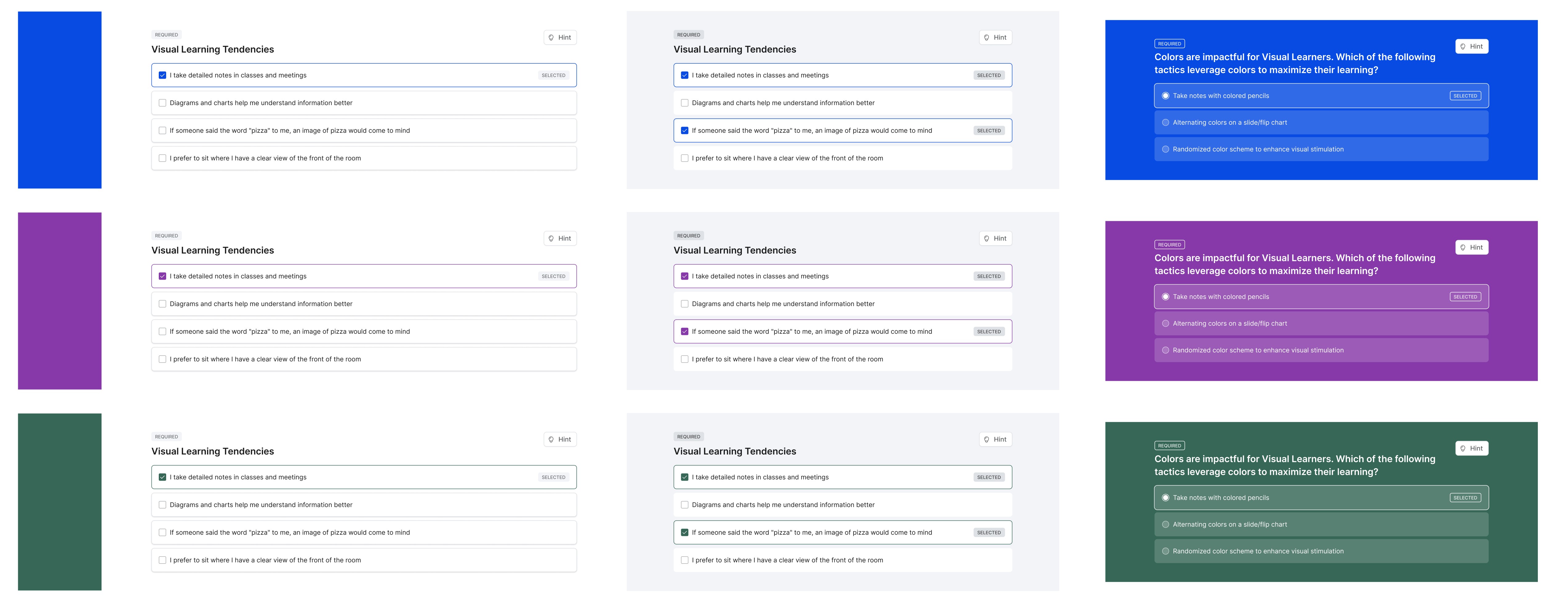
I designed a theming system that automatically derives 5 mix-and-match presentation styles from an account's existing primary color setting:
Classic (white background, minimal color)
Neutral Light (soft gray background, minimal color)
Primary Light (tinted background using primary color)
Primary (bold primary color background)
Neutral Dark (dark background, near-dark-mode)
Each theme automatically handles text contrast, borders, and UI elements. The system also includes accessibility safeguards: if the chosen primary color doesn't provide at least AA contrast for text, the theme automatically adjusts colors to ensure readability — prioritizing accessibility over visual excitement.
Authors can apply a theme to an entire Guide, mix and match themes at the block level, or even customize the primary color per block — giving them huge flexibility without any manual configuration or accessibility concerns.
A distinctive approach to theming
I intentionally chose NOT to replicate Rise's template library approach. WorkRamp's Themes system is:
Automatic (color derivation handles contrast)
Flexible (guide-level and block-level styling)
True to WorkRamp's brand (fast, easy, intuitive)

3) From Concept to Launch
Validating with the power user who inspired it
I presented the theming concept multiple times to the CEO, CTO, and product team to build alignment and refine the approach. Once I had internal consensus, I validated the design with a customer — a power user who had inspired the solution during initial research. He'd been using extensive custom HTML, CSS, and JavaScript to achieve visual customization in his Guides, which was time-consuming and difficult to maintain.
My goal was to eliminate the need for custom code for the majority of styling use cases. After walking through the theming system, he confirmed it would cover most of what he was doing manually — a strong signal that we were on the right track.
"I could totally use Themes. I would love to be able to just toggle this on instead of going into code mode, starting HTML and then having to make a change to various things. This is so much easier. It covers the scalable part of it with the global changes, and you can make the individual changes… I think this tool does a really good job.
Yeah. I love this."
– Adam G., Instructional Designer
Zero-migration release strategy
A critical design constraint was ensuring the system required zero migration effort. The original white background styling became "Classic" — one of the five theme options — which meant existing Guides automatically inherited a valid theme with no admin action required. New Guides could adopt any theme from day one.
I also designed theming for the UI surrounding the guide, such as the left-side navigation, which is essential to the Guides experience. Rather than offering all 5 options (which felt excessive for navigation), I created 3 navigation theme variants that aligned with the content themes and achieved what we needed without overwhelming authors with choices.


4) What We Achieved
Strong customer feedback, competitive positioning improved
Phases 1 and 2 of the Guide Modernization initiative launched successfully, with Themes driving measurable improvements in the learner experience. Learner satisfaction improved after rollout — customers who had previously received feedback that content felt bland and disengaging reported that those complaints disappeared entirely after implementing Themes.
The feature also strengthened WorkRamp's competitive position, with the sales team reporting stronger demos and more confidence in competitive situations.
"When we launched it [Guides with Themes] to the entire departments and started onboarding new hires, the feedback has been good. It's easier to read, it's more sticky when they're going through it, more exciting and keeps them engaged. All the surveys we've been running have been very good. Post themes, we haven't heard anything about it [bland content] again."
– Relay Team
"Team – thank you for these background theme options. We were waiting for this for a while, and it looks awesome. Our courses will look great."
– Neostella Team
Foundation for future visual enhancements
The two-part modernization effort (UI refresh + Themes) set the foundation for future enhancements like templating, multi-column layouts, cover images, and additional block types — with a clear framework for maintaining visual consistency and ease of use as the platform evolves.


