Search: Increasing User Efficiency by 43% Through Research-Driven Redesign
TL;DR Bloomfire is a B2B SaaS knowledge base that helps organizations share and discover information at scale. I led research, design exploration, and stakeholder buy-in to transform the search experience — the platform's most-used feature — through a two-part redesign that increased user efficiency by almost 45% and fundamentally improved how end users discover knowledge.

I joined Bloomfire as the sole designer, tasked with re-establishing design and UX practices after the role had been vacant. Through my own use of the platform and customer interviews, I identified two critical problems with search. First, the majority of users were navigating back to the homepage just to search because the interaction was inconsistent across pages. Second, search results prioritized irrelevant details while burying the information users actually needed.
1 ) Two Critical Problems Slowing Users Down
Problem 1: Inconsistent search access forced users back to the homepage
Search was prominent on the homepage through a large central search bar, but on secondary pages it was reduced to a small icon in the top-right corner that expanded to a minimal field when clicked. Digging into Pendo analytics, I found that 53% of users who navigated to the homepage from other pages immediately performed a search — suggesting they were coming back to the homepage specifically to search.
I validated this through customer interviews and user testing. When I asked users if they ever used the search icon on secondary pages, most didn't even know it existed. I also presented the concept of a persistent top bar to a customer advisory board, and they unanimously agreed they struggled with or avoided the secondary search interaction. The data and qualitative feedback made it clear: users needed consistent, visible access to search across every page.

Inconsistent search experience across pages, causing users to return to the homepage to search.
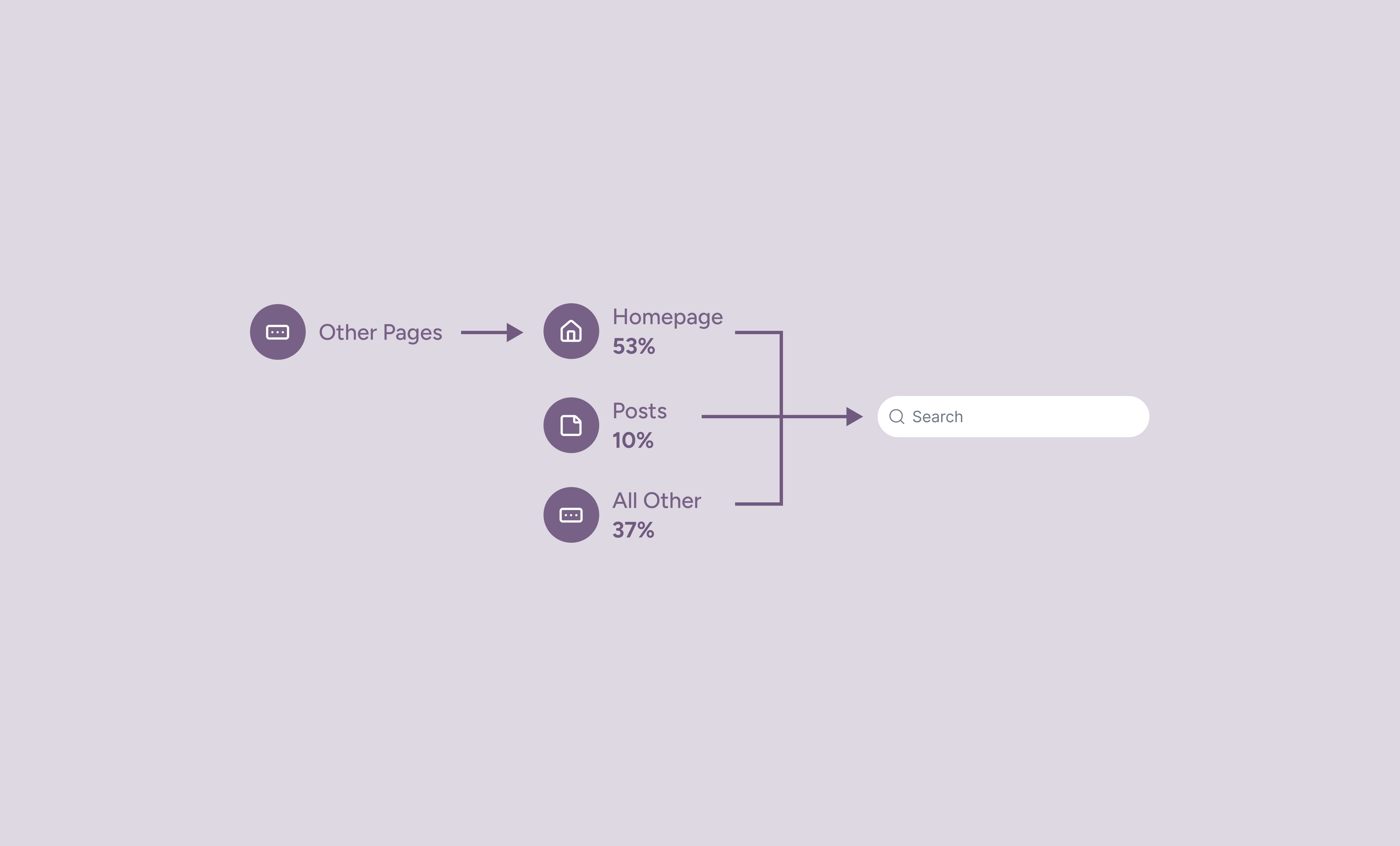
Over 70% of clicks into the search bar came from navigating to the homepage
Problem 2: Search results prioritized the wrong information
The second issue was harder to see at first because when I joined Bloomfire, all user feedback came from admins — the customers who purchased and configured the platform. The roadmap was heavily influenced by what admins requested, but we had no direct insight into how end users (the people actually relying on search to do their jobs, like customer support agents) were experiencing the product.
I advocated for two foundational changes:
Implementing Pendo to understand behavioral differences between admins and end users
Establishing an end user research program
I conducted more than 20 user interviews specifically focused on search behavior and needs. The research revealed a critical gap: end users needed different information than what the results were showing.
End users told me they looked for:
Title and content preview
Author and location within the knowledge base
Their own past interactions (had they viewed or saved this before?)
But the result cards prioritized:
Thumbnail images (decorative, not informative)
Engagement metrics (likes, views)
Search references (snippets showing where the query appeared)
Analytics confirmed this disconnect — admins clicked on search references to understand ranking, but end users ignored them entirely. The design was serving the wrong audience.

2) A Two-Part Redesign: Access + Clarity
Making search universally accessible with a persistent top bar
I looked at how other B2B SaaS tools handled this problem and found that many use a persistent top bar for search, notifications, and profile access — a familiar pattern users expect. Interestingly, Bloomfire used to have a top bar, but an agency had redesigned the experience to remove it in favor of the inconsistent icon-based interaction. However, they'd also introduced a useful sidebar navigation element. My proposal was to bring back the top bar and keep the sidebar — leveraging the best of both approaches.
The redesign introduced a persistent top bar with search, notifications, and profile access, ensuring the search experience was identical on every page.
Redesigning result cards to serve end users, not just admins
When the team decided to upgrade from keyword to semantic search, I saw a strategic opportunity to redesign the result cards as well — positioning the UI refresh as a way to visibly mark the technical improvement for users.
I needed to serve end users (who needed this information to do their jobs efficiently) without alienating admins (who had outsized influence on purchasing decisions).
I explored several approaches to balance these competing needs:
Search references: I considered making them admin-only or adding a toggle interaction, but for scope and implementation simplicity, I landed on collapsing references into a button with a popover. This preserved the functionality for admins while deprioritizing it visually for end users.
Thumbnail images: End users didn't find them useful, but removing them entirely would likely trigger pushback from admins. I kept them but de-emphasized them in the layout, making space for more meaningful context.
Information hierarchy: I prioritized the details end users consistently told me mattered — title, author, location, and past interactions. I improved spacing and visual hierarchy to make results easier to scan at a glance.
Card efficiency: The redesign reduced overall card height by over 30%, allowing more results to appear without scrolling — a direct response to user feedback about wanting to see more options at once. I also designed a series preview interaction that let users see what was contained in a multi-part content series directly from the search result card, eliminating the need to navigate away to get more information.


3) Measurable Results and Strategic Foundation
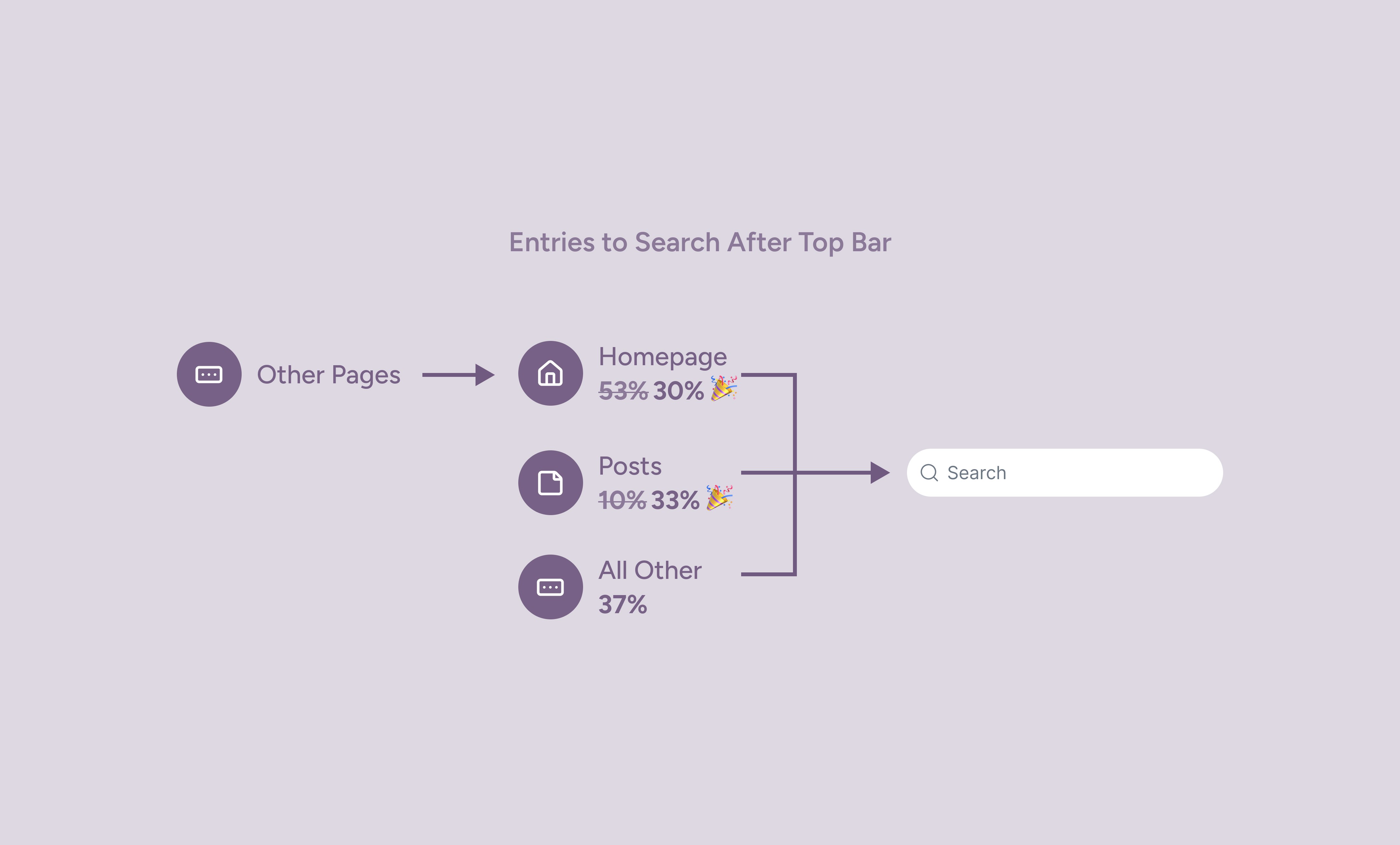
After launch, analytics showed an immediate shift in how users accessed search. Users were searching less from the homepage and more from secondary pages (posts specifically which were the top visited page in the app) — exactly as intended — eliminating almost 45% of those inefficient journeys. And the reduced card height meant more results visible at once, improving scan efficiency. Together these changes made finding the right information faster and more reliable, which matters most for users in high-pressure roles like customer support, where every second counts.
The search results redesign launched shortly before I left Bloomfire, but early feedback was overwhelmingly positive. For example: users, including admins who were initially a concern, loved the series preview interaction.
The project also set the foundation for future search improvements and established end user research as a core practice at Bloomfire.