Page Builder: Rearchitecting Content Discovery for Greater Reach & Relevance
TL;DR Bloomfire is a B2B SaaS knowledge management platform used by organizations to share and discover internal content. As organizations grew more complex, a single shared homepage couldn't serve their diverse audiences — content felt irrelevant to users, and admins were powerless to fix it. I designed the solution in two phases: first Homepage Builder, a customizable homepage that saw strong early adoption, then built on that with Boards, an entirely new content type that became a primary content discovery mechanism within the platform.

The Problem: Content Relevance Across Teams
On the surface, users were complaining that content wasn't relevant to them. But the real problem ran deeper.
The platform assumed every user in an organization had the same needs and served them a single, shared homepage. In reality, organizations had genuinely different audiences — sales teams, HR, customer success, engineering. The current experience made it too difficult for users to find content for themselves/their team.
Phase 1: Homepage Builder — Proving the Concept
The Insight
After customer interviews and internal research, a clear pattern emerged: admins needed the ability to serve content organized around how their organization actually worked. With the homepage being the most visited page and entry point to discovering content, we knew we should start there.
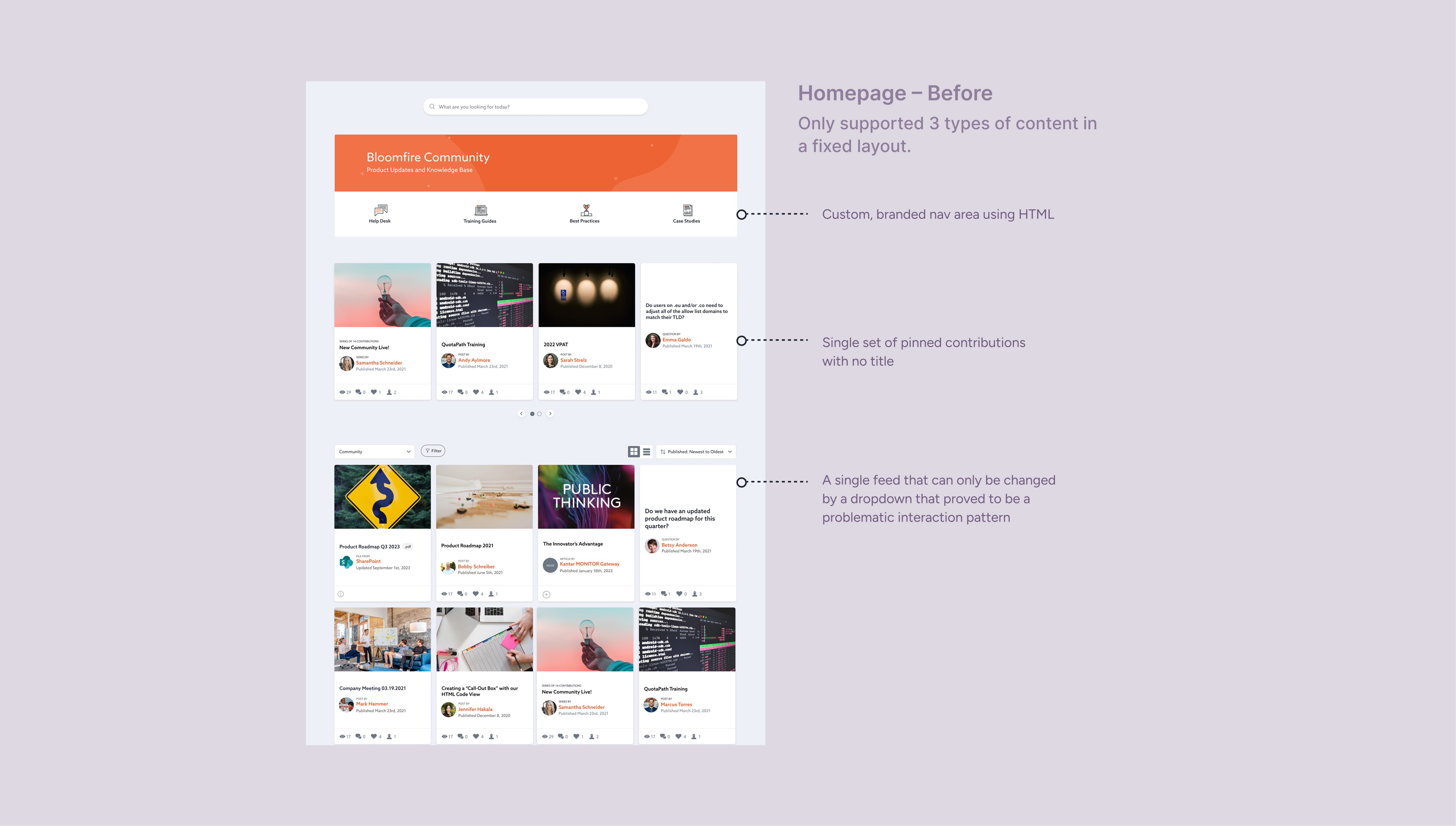
The constraint was building this without starting from scratch. We had existing components — card views, list views, and a feeds feature (custom content streams built on filtered criteria) that hadn't seen strong adoption. Rather than design around them, I saw an opportunity to give feeds the context and discoverability they were missing by enabling admins to surface them directly on the homepage.
The Design Decisions
I designed Homepage Builder around three principles:
Reuse what works, fix what doesn't. Rather than designing new card components, I used the existing list view and positioned two instances side by side — introducing a two-column layout without requiring new UI patterns. Admins could compose their homepage from familiar building blocks.
Give feeds a front door. I designed a new page template type that allowed a feed to be previewed on the homepage with a "see more" link to its dedicated page. Suddenly feeds had context, discoverability, and a reason to exist. A feature that had struggled in isolation became a cornerstone of the new system.
Multiple spotlights, not one. Admins had previously been limited to a single set of pinned content. Homepage Builder introduced multiple featured content sections — so a seasonal campaign, a new hire resource, and a team announcement could all coexist.
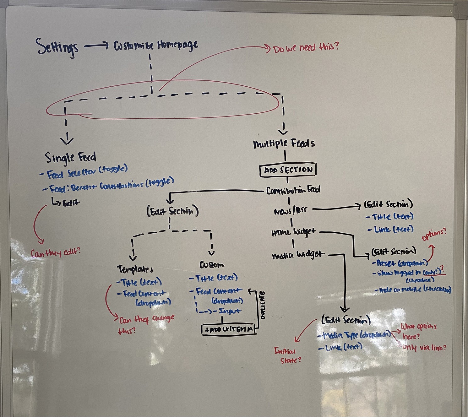
My white boarding exercise to map out the flow, help guide conversations, and align the team.
The Outcome: 23% of target users were actively exploring Homepage Builder just within the first week of launch. By a year out, over 80% had tried it.
Over the following year, it became standard practice — most accounts I visited in customer conversations had it actively in use. In fact, if a customer didn't have it in use it seemed strange. This validated the direction clearly enough that a page builder feature works well in Bloomfire. But ultimately Homepage Builder only meaningfully changed one page. What organizations actually needed was many destinations.


Phase 2: Boards — The Architectural Solution
Custom Homepages Weren't Enough
After Homepage Builder, we got mixed feedback: admins LOVED it, but the end user experience barely improved. We learned that without more sophisticated and dynamic personalization features (considered out of scope) the customizable homepage we built wasn't enough to move the needle on relevance and engagement.
Among the product team, we had long considered a feature with the working title "Topic Pages" as one solution to relevance, where pages about specific topics could be created, utilizing the Homepage Builder experience. I conducted over a year of research with our customers about this concept and rarely heard anything but strong enthusiasm for it. Topic Pages were so desired that customer success managers regularly fielded requests from their accounts about them. Customers wanted dedicated spaces for different audiences, teams, and topics that felt like first-class destinations — distinct, searchable, and permissioned.
Homepage Builder was a proof of concept. Boards (what Topic Pages launched as) was the real answer.
What Boards Are
Boards are a new content type in Bloomfire — individual pages that carry the full compositional power of Homepage Builder, plus:
A name, cover photo, and description that make each Board feel like a real destination
Public or private permissions so the right audiences see the right content
Full search visibility — Boards surface in results, so users can find them without being told where to look
A dedicated spot in the nav, elevated above the rest
The homepage itself became the home Board — familiar to admins who had used Homepage Builder, but now one node in a larger network of destinations rather than the single content discovery route.
Solving Discoverability — and Learning From the Past
Feeds had failed partly because users couldn't find them — no search visibility, no notifications, no natural entry point. I was determined not to repeat that with Boards.
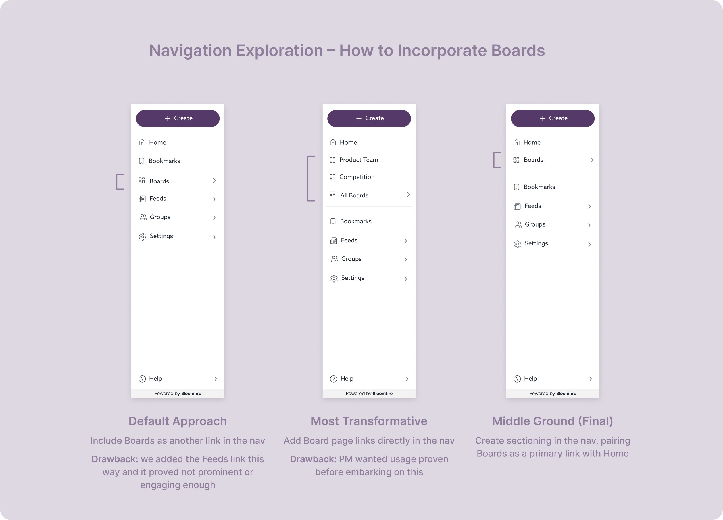
Search visibility was a major step forward, but I didn't think it was enough on its own. I wanted Boards to come to users, not the other way around. My proposal was to surface each user's starred Boards directly in the nav — persistent and visible, inspired by how Slack handles channels. It would have been transformative for how users navigated the platform.
The PM wanted to see usage data before committing to a nav overhaul of that scale — reasonable, even if my concern was that usage would be lower precisely because Boards weren't surfaced prominently enough. We landed on a middle ground: a dedicated Boards link in the nav directly below Home, separated by a horizontal rule. Not the full vision, but a meaningful step in the right direction.
The Outcome: Boards became a primary way for users to discover relevant content
Boards shipped in mid-2025 and have seen strong adoption — over 65% of accounts are actively using them. But adoption alone wasn't the goal. The real question was whether Boards would change how users actually found and engaged with content.
We compared clicks into posts before and after Boards launched, and the answer was clear. Boards have become a primary source of content discovery, now accounting for nearly 20% of all clicks into posts — and that number is still growing as more Boards are created.
This suggests something meaningful: Boards work as an intuitive content filter. Users are finding relevant content through a curated, audience-specific destination rather than scrolling a generic feed or relying on search alone.


What This Project Taught Me
Talk to end users (not just admins).
One of my most impactful initiatives from my time at Bloomfire was the End User Interview Program. Previously, all feedback came from admins, which I learned isn't the full picture. Of course admin satisfaction is key to account health, but end users are the majority of users in a platform and their experiences matter too. One of the main reasons for churn is low usage across a team/org. If we hadn't talked to end users, we wouldn't have fully understood that Homepage Builder didn't move the needle on relevance for them.
One of the cool aspects to Boards is that (depending on the permissions of the org) end users can make Boards too. When I was at Bloomfire I made a Board for myself in our internal knowledge base containing all my published content plus content I visited regularly. I essentially made a personal dashboard, which was a feature idea we were considering for the future. Boards unlocked multiple promising avenues to continue improving the knowledge base experience.